Inspiring Customer to book a Photoshoot
TIMELINENov - Dec 2019
PlatformResponsive website, iOS & Android app
ResponsibilitiesProduct design, prototyping, concept testing content strategy.
SweetEscape is a platform that connects professional local photographers and customers. Customers can book a photographer in their desired location for a photo session, and receive high-quality edited photos afterward. In Q4 2019 we are looking for opportunities to increase the conversion booking rate.
I was the designer for the project, I collaborated with product manager, engineers, operations, and marketing to make sure we achieve the objective.
How SweetEscape Works
Customers can visit the homepage or download the app and select their desired city or occasion. To book the photographer in that city, the customer must enter the details needed, such as date, time, and additional notes or requests. The Ops team then connects the photographer and customers, so they can discuss the details of the photoshoot.
Customers arrived at the location and time that has been agreed on, and have fun doing the photoshoot.
After the photoshoot, customers will received the high-quality edited photos in 2-3 days and can download or share it to their family and friends.
We observed that the overall booking conversion rate, especially during the consideration phase, is relatively low for visitors who land on our Homepage and Destination Page.
Problems
Conversion rate from Search.Meanwhile, the conversion rate from the Homepage and Destination Page was significantly lower, with only 1.5% and 0.85%, respectively. We assume that customers going through this funnel are still considering whether they want to book a photoshoot or are seeking inspiration on where they should have the photoshoot.
Conversion rate from Homepage.The conversion rate for orders that originate from search is at 6%, which is four times higher than other entry points. Our assumption is that customers who already know where they want to have their photoshoot done are more likely to use the search function to directly look up the city and book their session.
Conversion rate from Destination page.Our goal is to inspire and inform potential customers on how to get the most amazing photoshoot experiences. We want to help customers make decisions during the consideration process by providing helpful and relevant information.
Objective
We also aim to improve the destination pages to convince customers of the benefits of professional photography, which might include picturesque shots in hidden gem locations, local knowledge, hassle-free bookings, and more. Additionally, we want to enhance the photo browsing experience, making them more visually appealing and engaging. Lastly, we also want to improve booking conversion.
To create user archetypes, we talked with the ops team, who interact with customers the most and are familiar with their needs and pain points. We developed four customer archetypes. Here is a breakdown of each archetype:
Customer Archetypes
Love Birds
Couple who needs photography to document their important milestones in life, like pre-wedding, engagement, wedding, honeymoon, or simply holiday travel.
Expecting family
The expecting family would need the service for their baby moon, maternity photoshoot, and newborn photoshoot They want to document every part of their newborn journey.
Maturing family
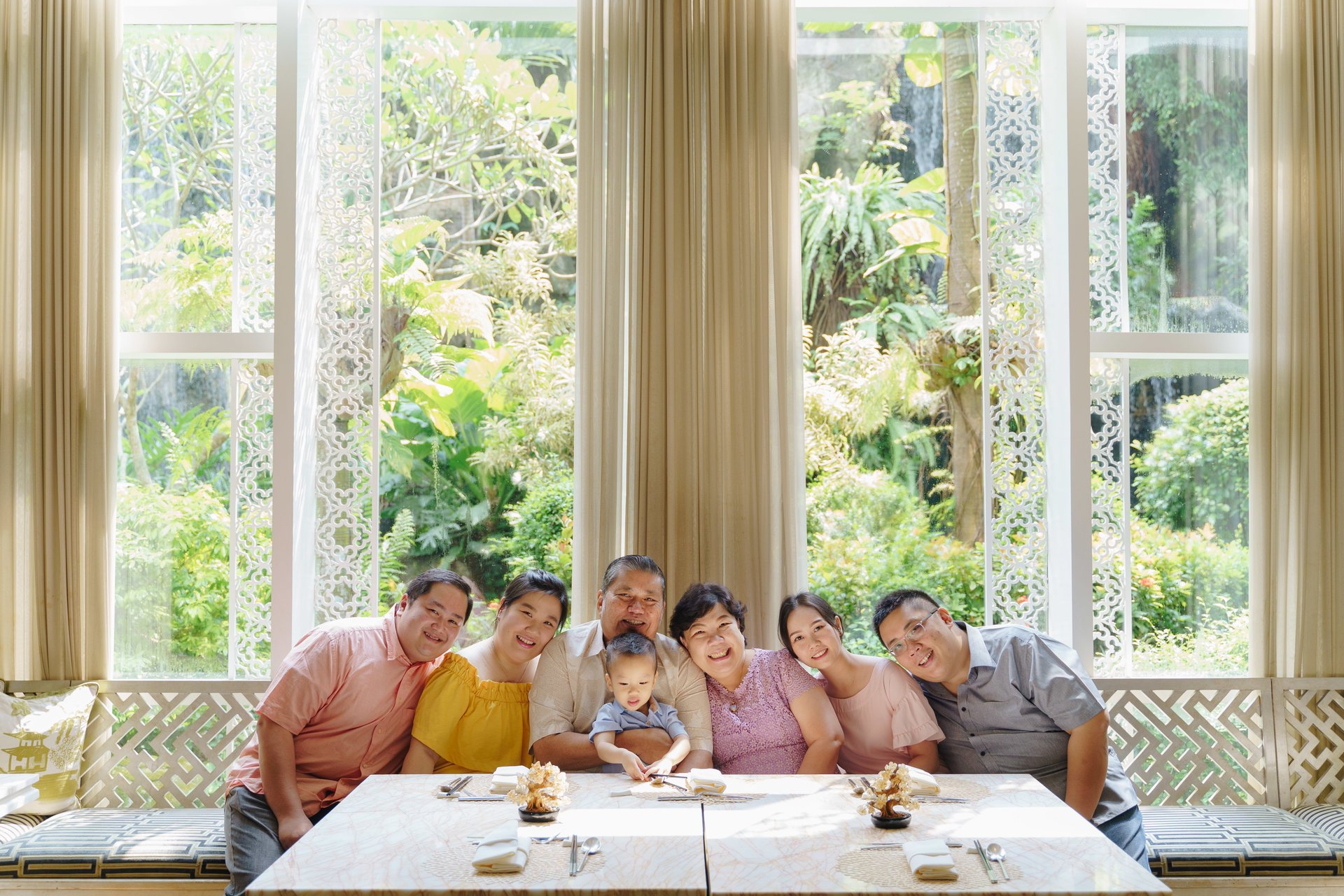
The maturing family would need our services as they would want to document important milestone of their lives such as birthdays, children graduation, family holidays, family photoshoot, wedding anniversary, etc
Group of Friends
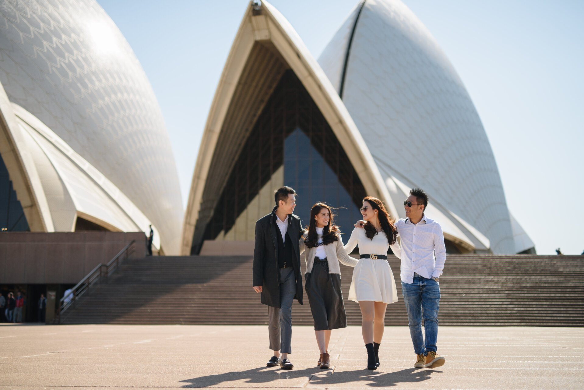
Friends who travel together (not backpackers) and would want to document their travel journey. This group would want to have pictures of landmarks and highlights they experienced during their travel.
Customers often take the time to plan and gather inspiration before booking a photoshoot.
They may consider who they are going with and what kind of experience they want to have.
Those traveling with family may plan more carefully and further in advance, while smaller groups like couples or solo travelers may be more likely to make last-minute bookings.
Instagram is a common source of inspiration for customers, who often browse location tags or hashtags to see what kind of shots can be taken at their destination and use them as a model.
Customers research everything from outfits and pose to location and submission ticket information in order to have the best possible experience.
Customer Behavior
Before proceeding with the redesign, we thoroughly evaluated our current design and identified potential challenges.
Challenge with existing design
Before creating the design, we developed user experience principles that align with what our customers need, ensuring that our design addresses their needs in a clear and effective way.
Design Principles
Visually Compelling
By looking at the previous photograph taken, the customers can better expect what they can get in their photoshoot
When customers are in the inspiration phase of planning their photoshoot, they might want to get inspired by what others have done. Like the location where they do the photoshoot, the outfit they’re wearing, and the poses.
Show, don’t tell
The biggest ambassador for us is not us but our customers.
Let our satisfied customers speak for us.
Don’t just tell stories, show our customers’ stories.
Design Process
Competitive Benchmark
I took a look at direct and not direct competitors to understand what type of content they put on a city page. They then listed the pros and cons of each competitor.
Sneak peak of the competitive benchmarkLow Fidelity Design
In the early stages, I sketched multiple city page ideas on paper to quickly visualize my ideas. I couldn't find the sketches, so I attached some low-fidelity wireframes here. The design went through many iterations to find the best content structure.
To ensure the best experience for our customers, we prioritize designing for mobile view first since 60% of our customers use iOS and mobile view. Here a sneak peak of the wireframe.
Low Fidelity designMid Fidelity Design
Creating low fidelity designs is helping me to quickly structure each section of the page. After discussing the initial design, we agreed on a first version and broke down each page.
City Page
We aim to showcase the best possible photo spots for customers to take their photoshoots and highlight the city's photo portfolio.
Photo Gallery
We are looking to provide customers with an engaging and visually appealing experience when exploring the city's photos. As many customers often turn to Instagram for inspiration, we want to create a similar browsing experience that showcases the city's best photo spots and allows customers to easily find inspiration for their own photo shoot.
Photo Spot
Customers typically book a 2-hour photoshoot that can cover 3-4 photo spots. Providing information about nearby photoshoot locations can help customers plan their photoshoot and cover more iconic places for their photos.
Photo Spot Details
To enhance the customer experience, it might be helpful to provide examples of photos taken at particular photo spots, including information about what to wear and how to pose. Additionally, displaying information about admission fees for certain photo spots can help customers avoid surprises and plan their photoshoot more effectively.
To validate our concept and test the prototypes, we interviewed four members of our internal team who match the customer archetypes. Our goal was to understand if this concept is enough to inspire them to book a photoshoot.
Concept Testing
Here are the insight:
City Page
The photo spot section as a map gives a sense of this being a travel app.
The "Know before you go" section is perceived as useless, as it provides general information that can easily be found on Google. It does not help them decide whether they want to book a photoshoot in this city or not.
The photo cover is too crowded with smaller photos below. Some participants expect the photo cover to be slide-able.
Photo Gallery
"It's nice to see the photos like an Instagram profile, but it would be nicer if I could see the whole photos right away."
The information in the photo is not really helpful, as they can easily find it on Google.
The filter by user archetypes was perceived as useful, as they might want to see photos that reflect their personal preferences when booking a photoshoot.
Photo Spots
Having photo spots displayed on a map gives a sense of this being a travel app.
A bookmark feature is a nice-to-have, but not really useful for them.
The "photo spots nearby" section is useful for getting recommendations for other photo spots they can visit.
After considering feedback from concept testing and discussions among the Design Lead, Product Manager, and Business, we realized that the initial design was too focused on travel content and did not sufficiently showcase the experience and results of the photo shoot. As a result, we made significant changes to the design in the final iteration. Here's a detailed walkthrough of the revamped pages.
Final Design
City Page
The cover photo design was iterated to make it more relatable for the customer archetypes by displaying pictures of at least one couple, family, friend, and solo photo. We make the photo spot guide simple without maps. We add new sections like Album to showcase what customers can expect if they book a photoshoot. Other sections like FAQ and Why Taking Photos with Us were also added to help customers make informed decisions and ultimately book with SweetEscape.
Photo Gallery
Based on the concept test, we changed the view from a grid to a scroll, making it easier for customers to browse through photos. We kept the filter, as it was perceived as useful for the customers. The biggest change we made was using a dark background, which helps to increase contrast and makes the photos pop out more.
Photo Spot
We decided to switch from using a map view to a simple card view. Instead of displaying detailed information about Photo Spot Details, we opted for a blog-style design that tells a story about the photo spot and includes photo examples. This approach is also easier to implement from an engineering perspective.
[New] Album
We are adding a new section called "Album." This section will feature photos of our customers, showcasing their own unique stories through photos taken during their photoshoot. Our hope is that this will inspire others to book a photoshoot with us.
Aside from app design, I also created the responsive website. Here are some screens:
As you can see from the final design, we need a significant amount of content, including photos, photo spots, and stories from our previous customers. To achieve this, I have created a content strategy guideline to help the ops team understand what is required to compile the content. Together, we prioritize the cities we will provide content for by analyzing the most booked cities. For phase 1, we are focusing on 10 cities and will evaluate the adoption and conversion rate.
Content Strategy
Additionally, we have emailed our photographers and asked them to contribute their favorite photoshoot locations and we have received hundreds of recommendations.
In early February 2020, we launched in our main cities and monitored how it is going. In one month, we managed to reduce the drop-off rate by up to 15%. Our goal is to further reduce the drop-off rate once the Homepage and Destination Page project is completed. Unfortunately, in March 2020, the pandemic hit, and no one was traveling let alone booking photoshoots.
Result
If I had more time and resource, it would be beneficial to validate and gather feedback from our real customers, rather than just relying on internal team members who may have unconscious biases.
Additionally, it’s important to note that the design will not be effective without great content. project highlights the importance of creating a content strategy and collaborating with the operations team to deliver a large amount of content in a short amount of time.
Learnings
Couldn't have done so without the amazing team at SweetEscape! Huge kudos to our heroes in the product, engineering, QA, and ops team.
Thank you for reading through! Hope you enjoyed my design and thought process :)


